Co-Creating & Maintaining the ACT Design System
The ACT Design System ("Style Guide") is used by external vendors and internal staff to keep ACT's website, web apps, mobile apps, social media assets, and printed materials consistent and accessible (WCAG AA) in visual presentation, interaction patterns, and written style. With the new guide, staff found styles easier and faster, and the widget library helped our team prototype faster.
Problem
When I joined ACT, their UX/UI style guidelines were several years old and in need of at least a review. At the time, they were a Sketch file (but our GUI prototyping tool was Axure RP), delivered to staff and vendors as a PDF.
Goals
- Make it easier to update than the PDF
- Make it a live URL for easier distribution
- Create a UI widget library to speed GUI design
Constraints
- Time was our biggest constraint, since this was often back-burnered for actual project work.
My Role
- Co-reviewing and updating existing styles.
- Recreating it in an Axure RP file.
- Designing the UI for navigating the style guide.
- Rewriting content as needed.
- Added our Brand department's content, and taught them how to maintain it.
The Team
Reviewing and updating styles was done with our 3 other UX Designers, and initially, a vendor Visual Designer.
Process
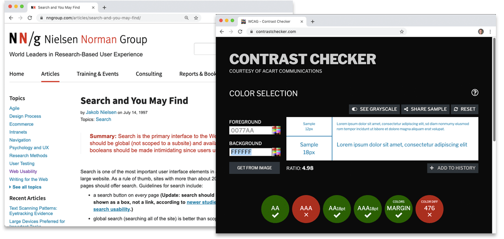
Our UX team of four collaborated in weekly design sessions to review and decide on style updates based on:
- Our own experience and opinions
- Usability research from Nielsen-Norman Group and others
- WCAG-AA accessibility standards and tools such as color contrast checkers.
We considered using InVision's DSM, so I started creating our style guide in that, but we concluded it wouldn't meet our needs as well as Axure RP.
Results
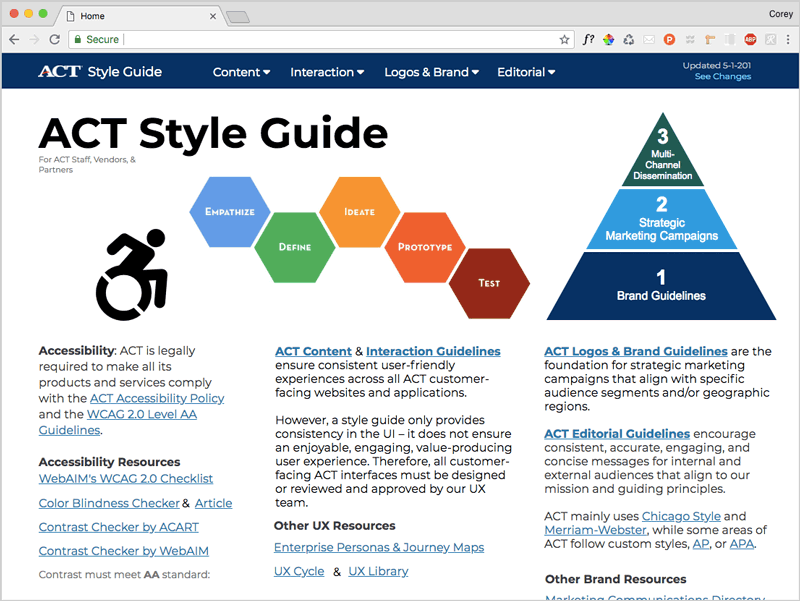
I theorized users wanted quick random access to elements in the site, so I used persistent mega-menus as global navigation for the easily updatable site.
Each element had:
- Usage guidance
- Accessibility guidance in blue callouts.
- CSS specs in orange
Previously, UX, Brand, & Editorial guidelines were in separate documents. We combined them into this single style guide to make it easier for staff and vendors to find any style-related data.
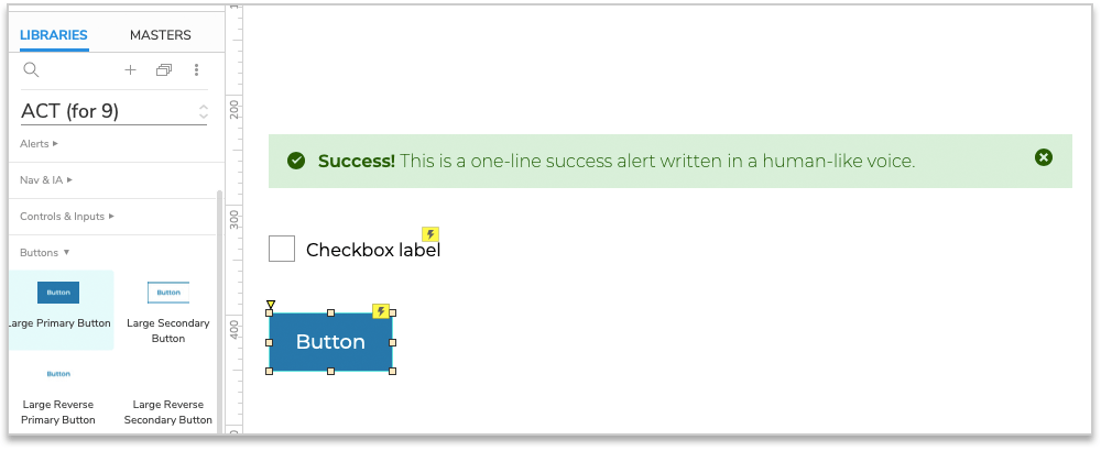
I also created an ACT Widget Library in Axure RP so the other designers and I could quickly make style-compliant mockups.
Learnin'
Through this project, I learned:
- how to make Team widget libraries in Axure.
- InVision's Design System Manager (DSM), though it ended up not being flexible enough for what we wanted to do.
Creating our style guide in Axure made a lot of sense because it's our UI prototyping tool, but Axure sites aren't searchable, and our Brand team needed an Axure license to update the site, neither or which were ideal. So the solution wasn't perfect, but I'm not sure there was a better solution out there for our needs.
This project was also a nice opportunity for the UX team to collaborate with our Brand team, which hadn't been happening much.