Redesigning the KU.edu Responsive Templates, Homepage, & Admission Site
From 2006-2013, I was the lead web designer for the million-page University of Kansas web presence. A few of my main projects are explained below.
Problem
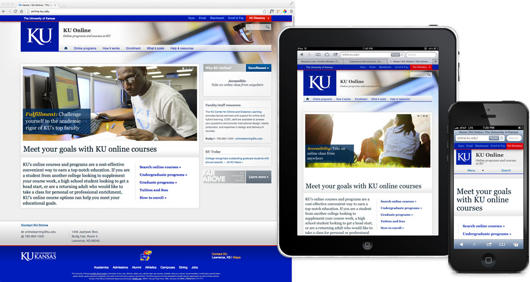
The KU web presence was a hodge-podge of static non-responsive HTML sites, guided loosely by some suggested templates.
Goals
Design a new responsive template, information architecture, and global navigation system flexible enough for non-tech staff to implement in their new Drupal sites.
Constraints
Limited development resources – we only had a few developers, and they had some other duties in addition to this large project.
My Role
I was the lead and sole UX designer, tasked with:
- User research
- Information architecture & global navigation
- UX Design
- Visual Design alongside some in-house graphic designers
- Usability testing
- Teaching the new site guidelines to other campus site admins
The Team
I worked with:
- An IT lead and several developers
- Some in-house graphic design staff
- Various on-campus site admins
Processes & Results
Information Architecture
For the new IA, I started by creating a huge spreadsheet where I logged all the main content chunks across hundreds of sites to find the commonalities and patterns. With that data, I identified several site types (eg, academic, support, research, etc), and created a recommended architecture for each.
I ended up choosing a two-level horizontal navigation so staff couldn't add tons of top-level categories, which had been a problem. The design also had a top meta nav bar and "KU Directory" pulldown so students and staff could quickly access their myKU, Blackboard, etc. sites.

Degree Viewer
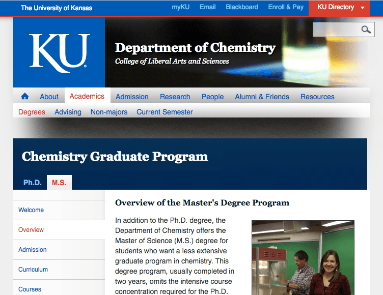
During the content audit, I noticed that our very important degree-program content was weak and wildly inconsistent. So I created the "Degree Viewer" concept, which provided a nicely formatted structure that would encourage staff to enter all the info that current and prospective students need, displayed in an appealing way to help student recruitment.
Once this large project was done, I was the lucky guy who got to reinforce the new site requirements (aka the 'web police'). But I also helped advise and educate staff on best practices, which was much more fun.

KU Homepage
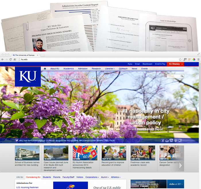
The objective of the 2012 KU.edu home page redesign was to brand KU as a top-tier public university, disseminate the latest KU news, and get users where they want to go. The challenge is that a university home page has many audiences with varying objectives, often quite different from the objectives of the designer's boss's boss. So I created user personas and scenarios to help guide the design and communicate the various user needs.
The solution's hero area make's a great first impression with inspiring campus images paired with impactful news, resting on a tray for more news articles (to satisfy said boss's boss). The lower area served as a gateway for each respective audience, with links to their probable content requests. Overall, the response to the redesign was very positive, and the design was used until 2018.

KU Admissions Site
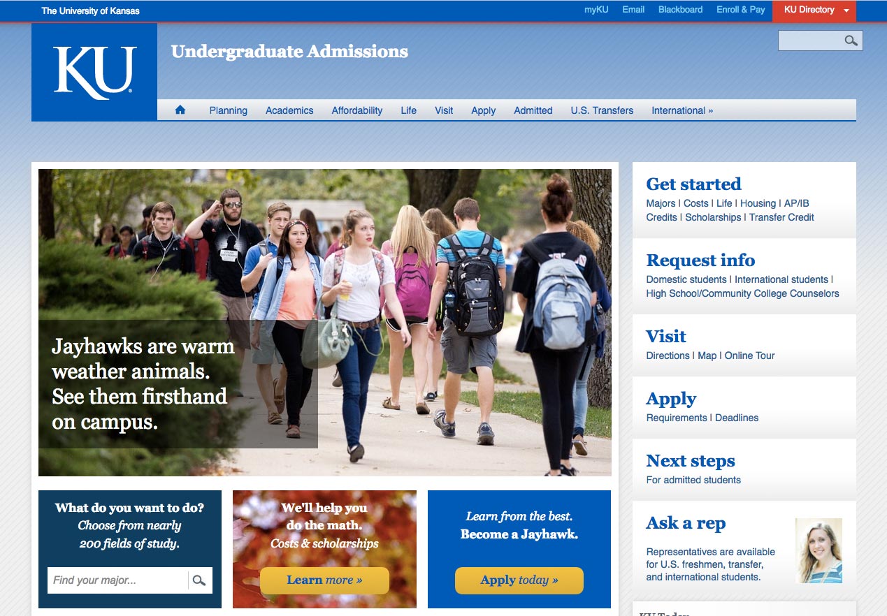
A university's admission site is often the first-touch front door in student recruitment. Students and parents want quick answers (Do they have my major? How much will it cost? Will I get a scholarship?), but may also want to dive into the details, which are sometimes in a shoddily made departmental site. So what should we put in the Admission site and when to link out? What about the slightly different info for Transfer, International, and Grad students? And how to manage it all with very little staff? Aaarrgh! A tough task.
For the 2013 redesign, I decided to include all the high-level info, implemented in the CMS as mobile-friendly adaptive content that changed based on audience (ie, incoming freshman, transfer, etc). The hero space gave the "sense of place," while the lower cards gave quick access to answer the common questions, with a major search and costs link. The right side was action-oriented, serving as a quasi checklist to help guide students and parents through the process. The site was well received and earned a CASE.org Gold Award.
