Designing for SchooLinks, an EdTech SaaS startup
SchooLinks is a fast-moving EdTech startup whose responsive SaaS is the premier college and career readiness platform for K-12 staff and students.
Problems
SchooLinks excels at adding features quickly through fast-moving agile development, but much of the early design work was done by a young design team with little to no usability testing or research, so UX debt is a problem in some areas of the large multi-module application.
Goals
- Quickly design intuitive efficient functionality that fits (or improves upon) the existing design system.
- Help improve our design system.
- Improving the UX maturity of the organization through persona creation, improved design processes, design reviews, and usability testing.
Constraints
- Lack of Product Managers: When I started, there were no PMs, so designers took on some of that load.
- Tight launch deadlines: We continually evaluate what improvements and functionality are worth the implementation time.
- UX debt in some areas of the app can delay improvements that we'd like to make.
My Role
As the most experienced designer on a team of 3, I:
- Led creation of user personas
- Journey mapped, task analysis, & wireframed
- Assisted with product strategy
- UX, UI, and Visual Design
- Assisted with Figma design system
- Wrote UI copy
- Usability tested
The Team
When I started, the company had 15 people, and I mainly worked with the CTO (who was the de facto PM) and two other designers, one per pod. When I left, it was 50+ people, and I work more with the pod's new PM, collaborating with devs and ops staff.
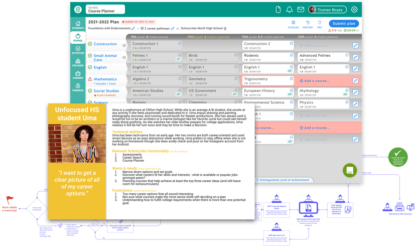
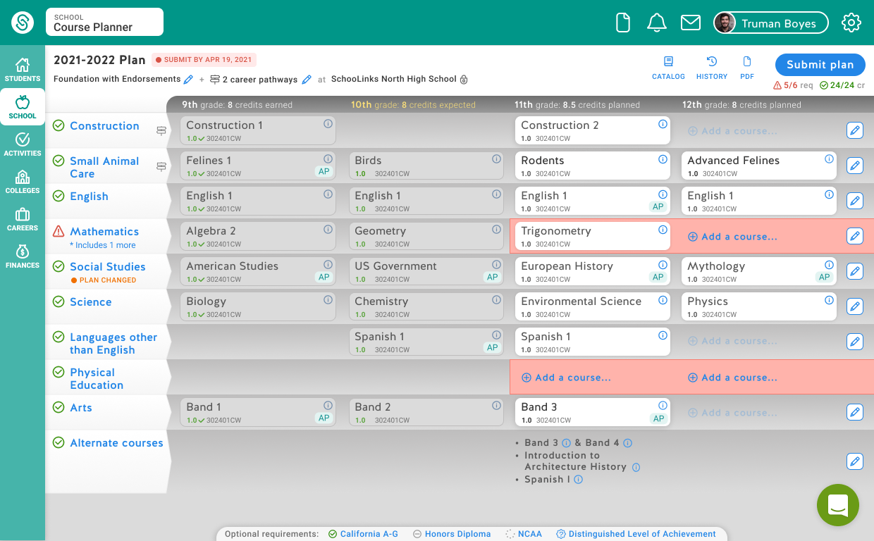
Results: Course Planner
As part of the Course Planner project, I decided to improve some deficiencies in the "Before" Plan Summary page:
- It wasn't very clear which courses were completed vs. upcoming, so I used a stronger gray/white contrast.
- The star icon was not intuitive, so I converted it to an "Includes 2 more" text link.
- The header and footer bars were not space-efficient, and there was no page title, so I combined the header and footer into a single streamlined header, and moved the "Alternate courses" into their respective grade column in the course grid.
- The "Additional options" footer button gave little information scent for the History and Secondary Plans hidden in it, so I pulled its functionality out, with the History link at top right, and the Secondary Plans shown in a small bottom bar, each with a status icon.
Before:
After:
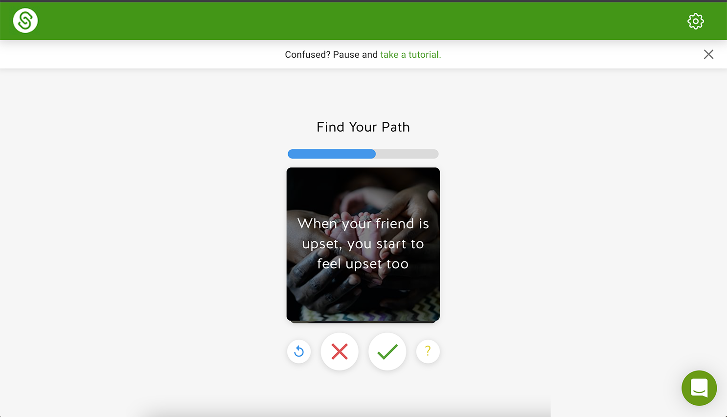
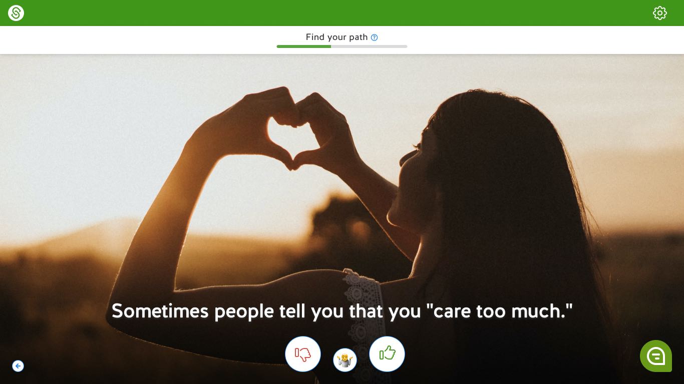
Results: Career Assessment
During onboarding, students take a "Find your path" career assessment. I felt the existing design had room for improvement:
The icons were counter-intuitive because they repurposed well known icons for different meanings:
- Refresh icon = "Back"
- X/cancel icon = "Disagree"
- Check/submit icon = "Agree"
- ?/help icon = "Not sure"
So I used more standard intuitive icons, moved the seldom-used Back button out, and centered the Not Sure button to help imply it's meaning (and it's smaller because the more it's chosen, the weaker the assessment results, which we also explained in a first-click tooltip).
The small image wasn't impactful or engaging, so I made it fill the screen, overlaid the text and buttons, and added a lower gradient to increase readability.
The click-through tutorial wasn't needed after the redesign, so I pulled the title and progress indicator into our common header bar, and provided an instructional popout from the "?" icon.
Before:
After:
Results: Templated Notes & Analytics
Process
My process varied based on the size, scope, speed, and complexity of the design task, but whenever possible, we:
- Got input from our Ops and Support staff (sometimes in the form of "Suggestion" tickets in Jira)
- Watched relevant user screen recordings from Fullstory
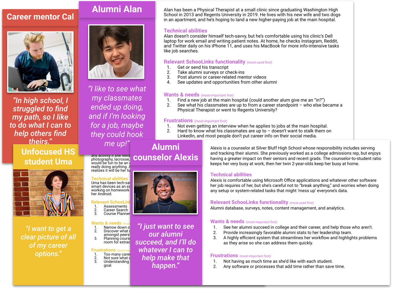
User personas: Since not much time was allocated to creating true research-backed user personas, I led the creation of user "proto-personas," which serve the same purpose but are written by our staff members who have enough lived experience with the user type to write a fairly representative persona. I wrote a few myself, and created a template and instructions for our staff to contribute.
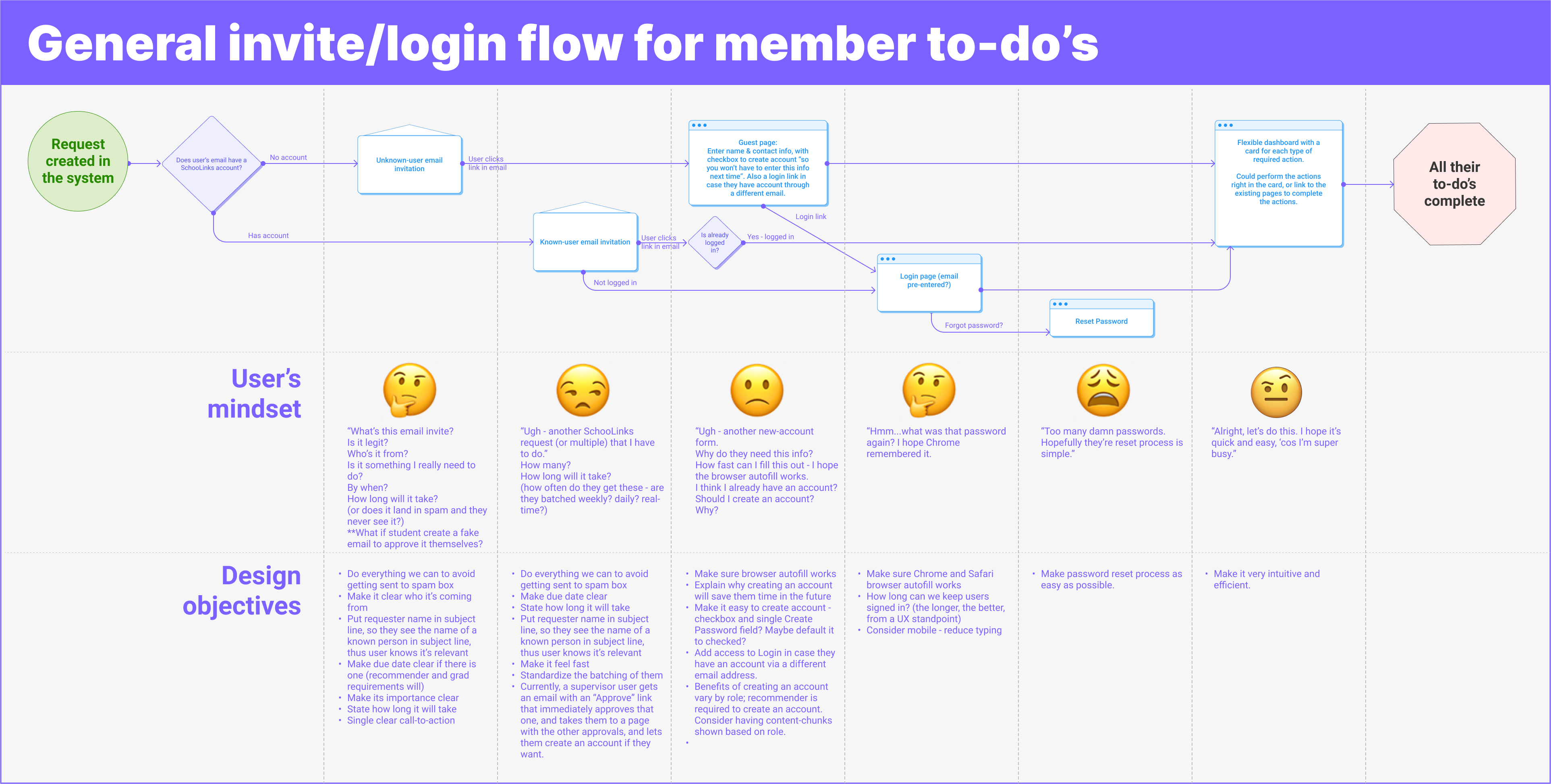
For member onboarding improvements, I created an empathy flow map to help elucidate the user's mindset and resulting design objectives for each step in the process.
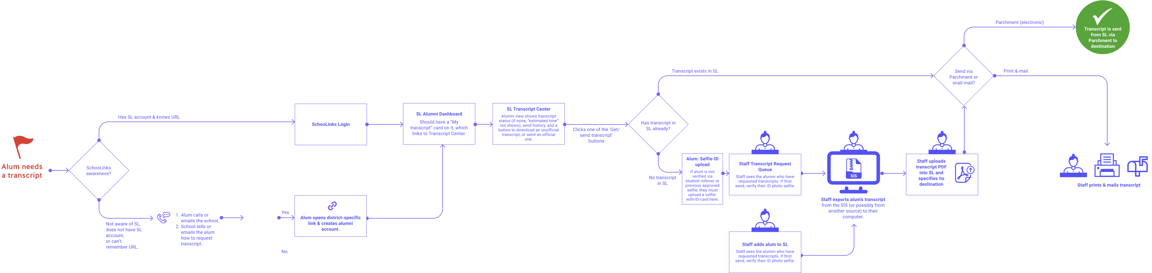
When designing the alumni transcript request process, I created this flow chart to help us understand and improve all possible actions – including offline ones – within the process.
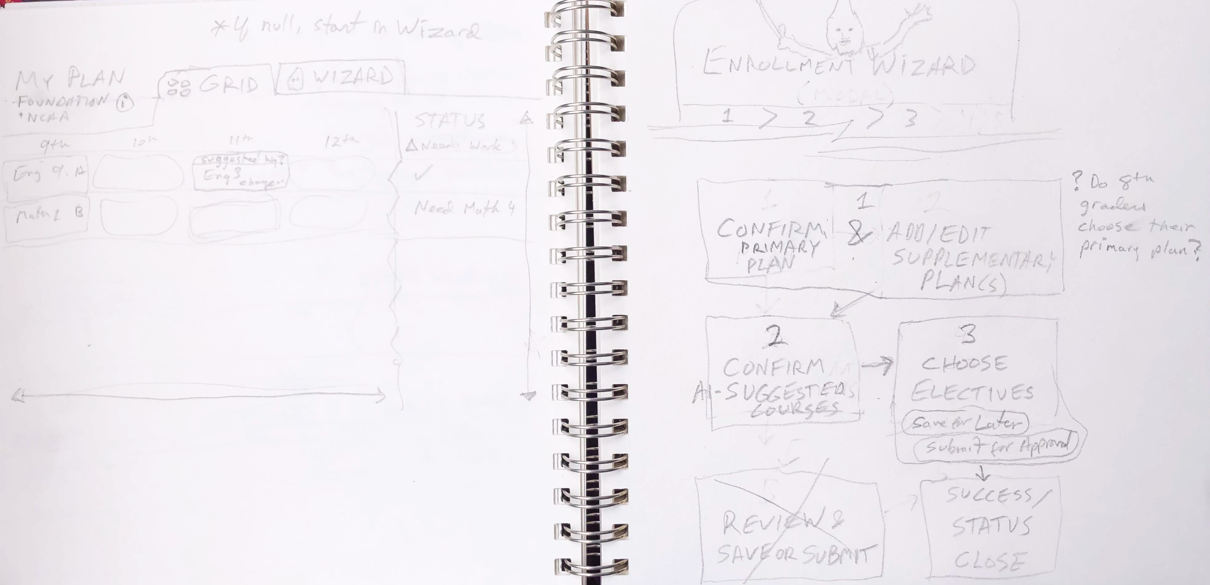
Early on, sometimes I'll sketch out initial ideas to quickly see what may or may not work. Here are a few from the Course Planner project, when I was considering using a literal wizard. 🧙♂️
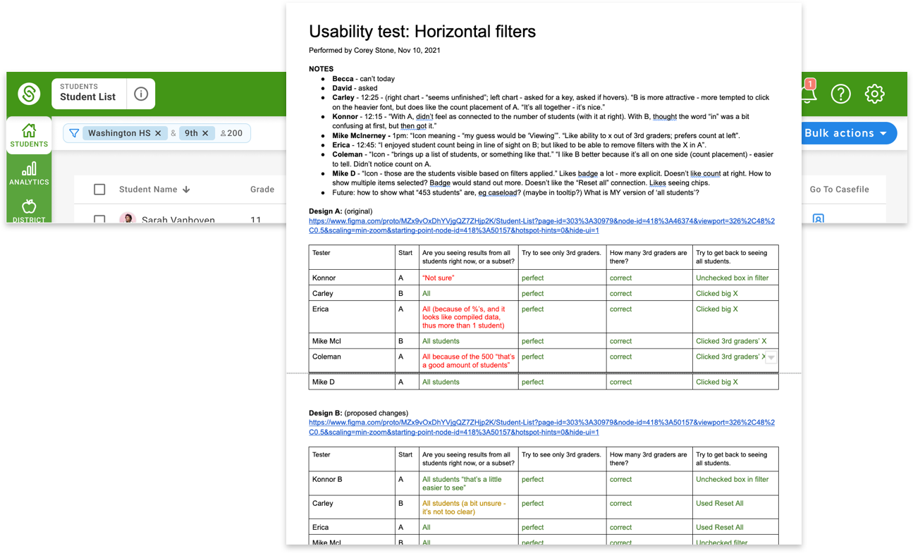
For the student filter designs, I conducted a moderated remote A-B test to compare the existing design with my first proposed design, then ran multiple rounds of usability tests to assess the intuitiveness of the new designs, iterating and retesting several times before arriving on the final solution.
Learnin'
Speed: SchooLinks moved very fast, which is generally a good thing, but it required us designers to be very flexible and efficient with process, making sure not to skip what's really needed to produce a good outcome. And as the senior-most designer, I sometimes stepped in to help make sure we were staying focused on the real user needs, and not designing to edge cases thus muddying up the happy path.
No PM's = more designer documentation: For much of my time there, we didn't have Product Managers, so designers' scope included more requirements discovery and documentation.
Figma: I'd used Figma for a few small projects before, but SchooLinks was my first time using it as my primary tool (I'd been using Axure RP – an advanced prototyping tool). So I had to quickly get up to speed on autolayout, components, design library management, plug-ins, and a myriad of little tricks and keyboard shortcuts.