MyACT Responsive Portal & Test Registration (2018)
MyACT is ACT.org's responsive e-Commerce portal where ~3 million students per year register for the US and Non-US ACT tests, view scores, and explore careers, colleges, and majors. Registration time decreased from 30 to 7 minutes, user feedback is excellent, and revenue-per-registrant is expected to increase.
Problem
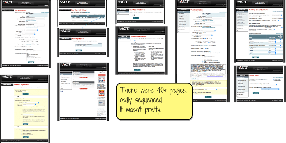
ACT's outdated non-responsive 40-minute test registration process was hurting the brand experience, and the crumbling platform limited future progress.
Goals
Redesign and replatform it into a modern, efficient, intuitive, value-adding experience that helps cross-promote other relevant ACT products and improve our brand.
Constraints
- UX Debt: I started after a vendor design was poorly partially implemented.
- Tight launch deadline for Non-US registration forced us to manage UI change carefully.
- 60 years of business rules and edge cases in the "MVP." 😳
My Role
I'm the sole designer, working remotely on:
- Product Vision
- UX Design
- UI & Visual Design in ACT's design system (which I co-manage)
- Writing all UX copy and email notifications
- Usability testing
- Product Management for a few months
The Team
I worked in an agile process with:
- 2 product managers
- 2 product owners
- 3 business analysts
- 1 enterprise architect
- 3 agile scrum teams, each with a scrum master, ~6 developers, and a few testers
- Various subject matter experts as needed (e.g. Customer Care, Test Accommodations, legacy systems)
Process
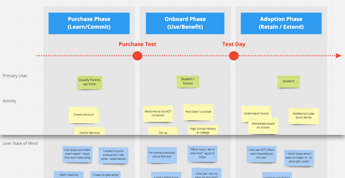
First, I documented the current system and started learning the many business rules.
Our Customer Care agents and user surveys informed me of users' frustration with password resets, the length of registration, and not understanding why ACT collects so much data.
Sitting in on support calls also helped me empathize with the customer by hearing their voice and problems first-hand.
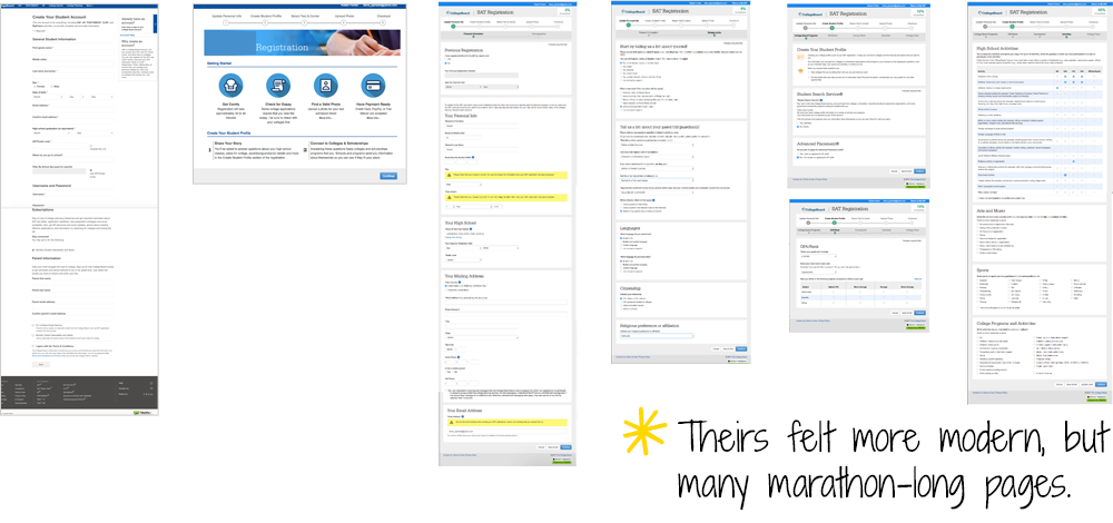
Competitive analysis showed that our sub-par system was only somewhat worse than our main competitor's barely-par system. Always nice when the bar is low.
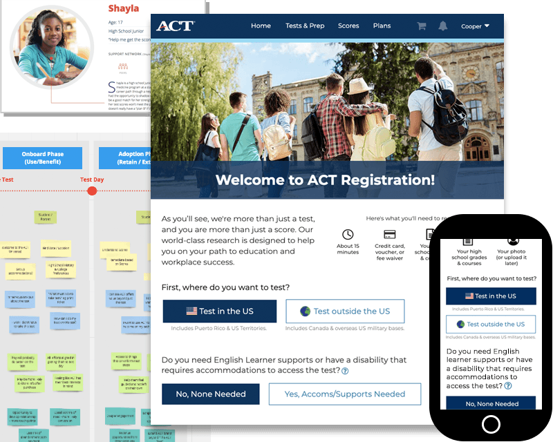
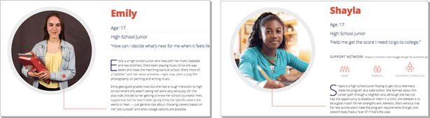
I reviewed ACT's relevant existing personas to get insight on their varying needs and desires.
An empathy / needs map that our other designer and I created to delineate both the business needs and the users' needs and feelings, which helped us explore ways we could meet them.
I ideated on flows for various use cases such as requesting test accommodations and registering for various tests with different data-gathering needs.
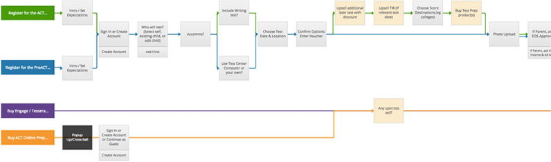
I designed interactive prototypes in Axure RP, iterating based on feedback from PMs, tech leads, and subject matter experts.
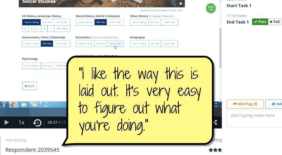
I conducted unmoderated usability tests on Validately.com (shown here), which helped me tweak labels for intuitiveness and reduce visual noise.
I assisted our user researcher with moderated usability testing, which confirmed we were on the right track!
Results
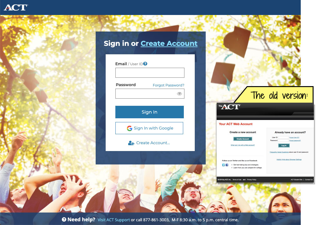
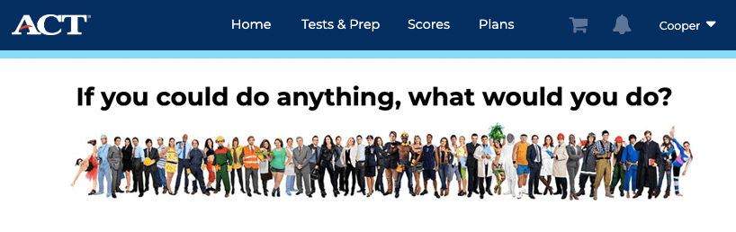
I designed a new Cognito-based user account system for login, verification, and forgot/resets. Other than lots of nitty-gritty UX details, I added aspirational imagery to remind students of their purpose for engaging with ACT.
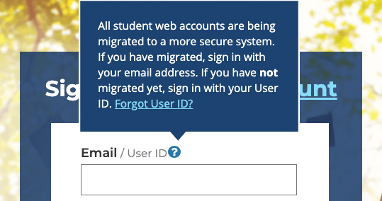
I wrote all UI text for MyACT, including tricky user migration from User ID to email login, with 'Forgot User ID' still in the old system. Ugh. Also, non-US testers used the new accounts a year before US testers, so we had to fork traffic appropriately from the public site.
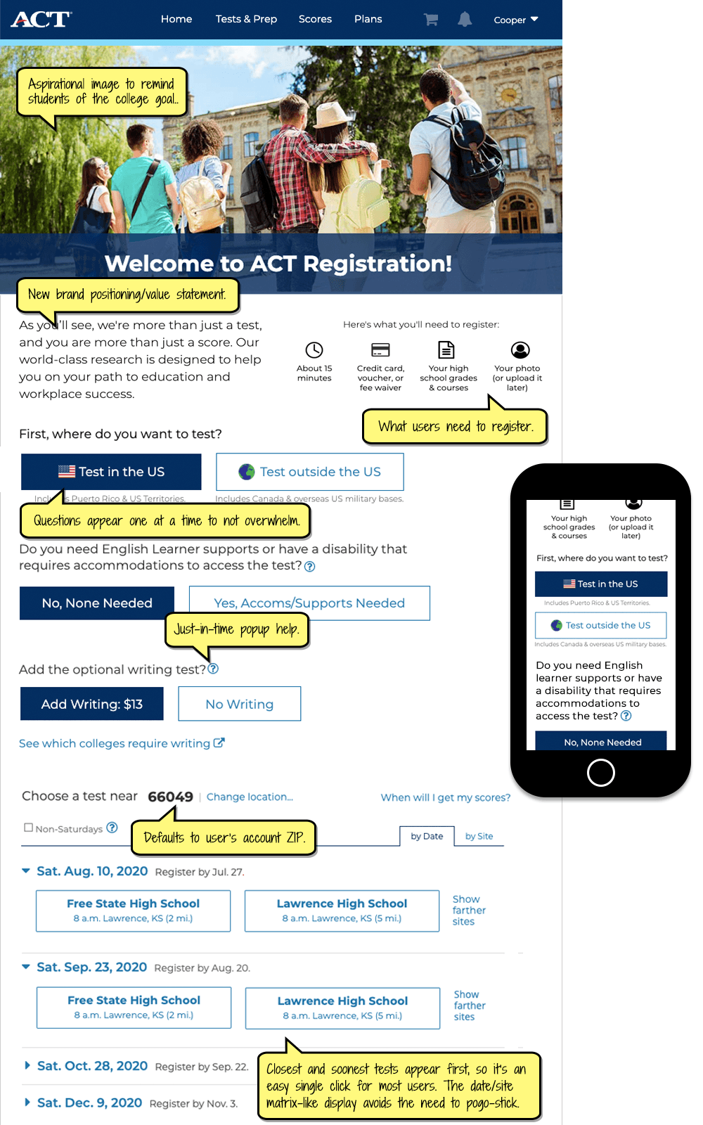
Test option selection was spread out awkwardly across several pages in the old system. The new intuitive responsive one-page design reveals questions one by one, flexing based on each answer. I usability tested and iterated this design quite a few times and it is working well.
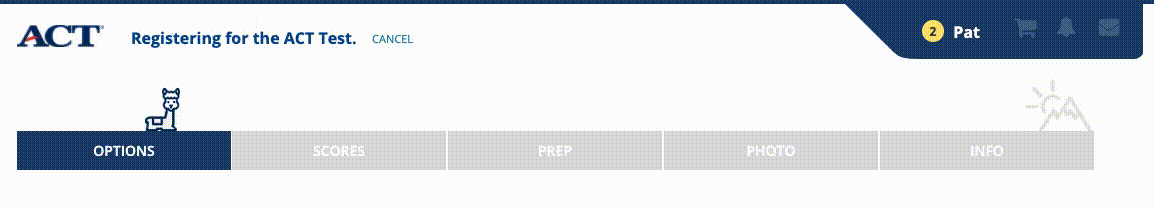
I added some delight with an animated alpaca that leaps closer to the far-right 'peak' at each step in the process, then sits and looks at the user. Unfortunately it got scoped out of the MVP launch, but users (and our staff) really liked it.
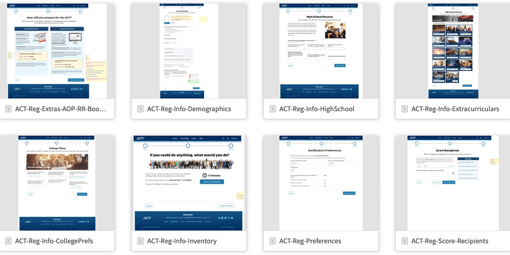
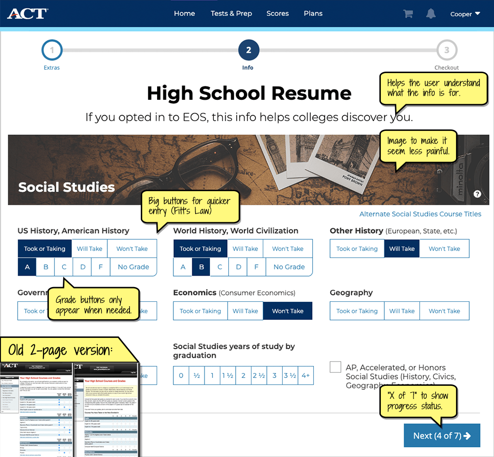
Course grade entry's 60 questions are the most tedious part of registration. I couldn't remove any questions, so I made entry faster by using bigger buttons and reducing finger/mouse travel by displaying grade entry just below the "Took or Taking" button (Fitts' Law ). Header images were eye candy to improve user perception of the tedious process.
The 72-question career-interest survey was another tedious process for users, so I made it more fun with animated emoji buttons. I mocked up the animation in Axure RP, and it looks much smoother than this choppy dithered GIF screen recording.

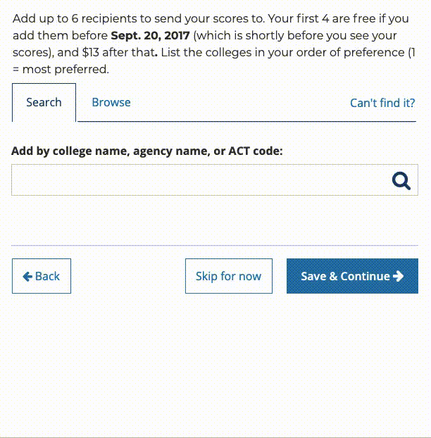
College selection in the old system was a cumbersome multi-step process with 8 different look-ups to find a college or agency, so I redesigned it as a single federated search box with overlaid results. The interactive prototype was made in Axure RP.
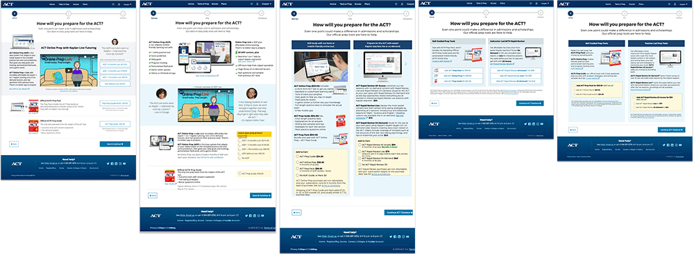
The "extras" (up-sell) page design has been iterated a lot based on usability testing and PM feedback. My plan is to do A-B testing soon after it goes live.
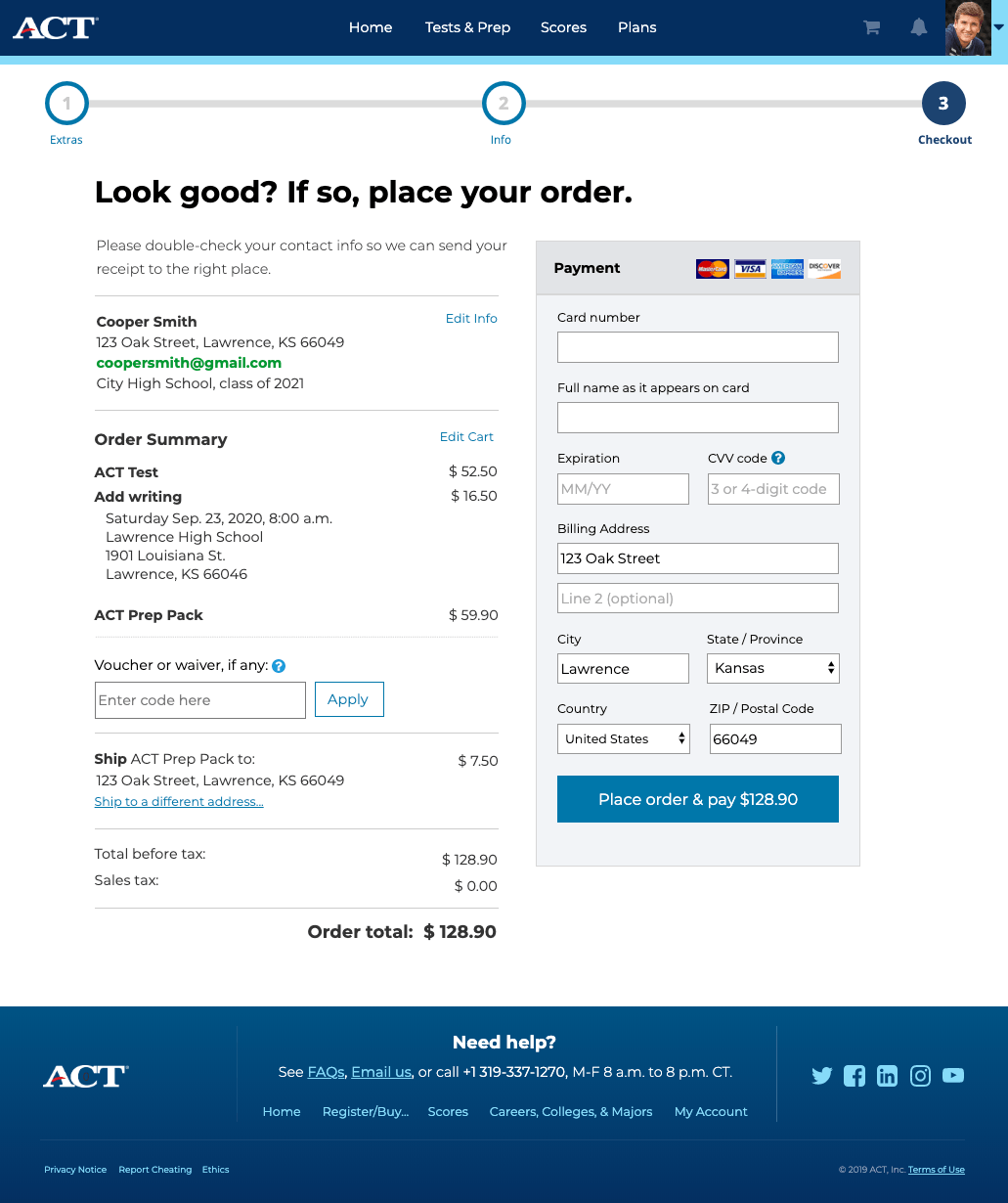
Although most of the work was on the long registration process, it's still an e-Commerce site that sells multiple products and has the usual complexities of terms agreement, taxes, shipping (for some products), and payment.
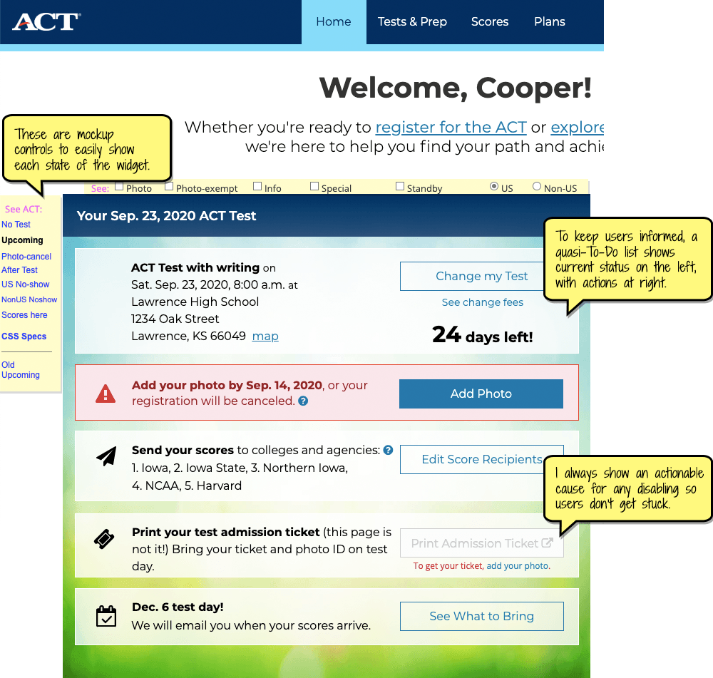
After registering, a persistent To-Do-ish status widget appears on the user's dashboard (aka Home) so they can clearly see their test status and easily perform any necessary actions, which should reduce support call volumes.
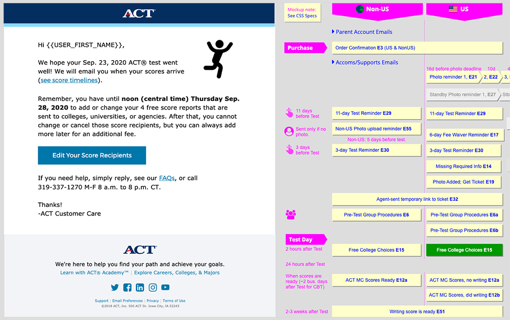
I redesigned and rewrote all transactional emails to improve their tone, clarity, and brevity. The mockup also lets our Developers, BAs, and reviewers easily see each email and when it occurs by clicking it in the timeline view to the right of the email.
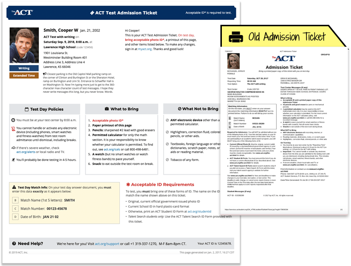
The printer-friendly HTML test admission ticket sorely needed a redesign, so I chunked and rewrote the content for easier reading and faster visual processing for test proctors.
Learnin'
This was a big, long, ongoing project that didn't start well. They didn't have a user/design-centric process or culture, and when developers needed UX guidance, they went to the BA who had been designing mockups. It reinforced my belief in the importance of strong relationships between designers and developers. It took awhile, but eventually the whole team happily came to me for any UI problems or changes needed to my mockups.
Working in ACT's SAFe Agile process across multiple teams definitely improved my skills in Agile, Jira, and product management (which I did for a few months).
My Axure RP prototyping skills improved as I learned how to use its variables and adaptive (responsive) views. Axure doesn't get much pub, but it's a pretty good tool!
Finally, the tight launch deadlines and 'UX backlog' mentality taught me to know when to be patient with UI changes (or lack thereof) and when to push for the most important UX improvements, all while trying to educate the company on how to move user-centric design earlier in the process to improve coding and implementation efficiency, removing the need for so much rework. As John Wooden says, "If you don't have time to do it right, when will you have time to do it over?"
Related: I co-created and maintained the ACT Style Guide.