Founding HERO Keyboard
The original promo video that I made in one night.
HERO is an iOS app that I conceived, designed, marketed , and managed contract developers to build. In English, just 9 letters are used 80% of the time, so my patented design makes them bigger and centered where your thumb likes to be. The result? Finger travel is reduced by 35%, or "3 feet per tweet."
Problem
One-handed mobile typing is hard and inefficient.
Goals
Redesign the QWERTY key layout but keep it intuitive and easy to learn.
Constraints
I'm not an iOS developer, so I'd need to pay a developer to build it, or partner with one. I ended up hiring contract developers, so my limited money limited my development hours.
My Role
As the solopreneur, I did everything but build it:
- Product Vision
- UX Design
- UI & Visual Design
- Logo, branding, & marketing
- Writing all UI text and marketing copy
- Customer support
- Managing the developer
The Team
A couple different freelance developers were used, hired on Upwork.
The story of HERO
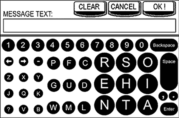
My concept from 2001 (pre-smartphone) for an embedded in-truck messaging system.
It was 2001 (remember pre-smartphone life? Bring your map!), and I was designing a small touchscreen keypad for an in-vehicle messaging system. I'd recently finished my Biomechanics/Ergonomics master's thesis measuring muscle activity on physical keyboards, and after double-checking the anthropometric charts for touch size standards, I realized the screen was too small to make all keys the recommended size.
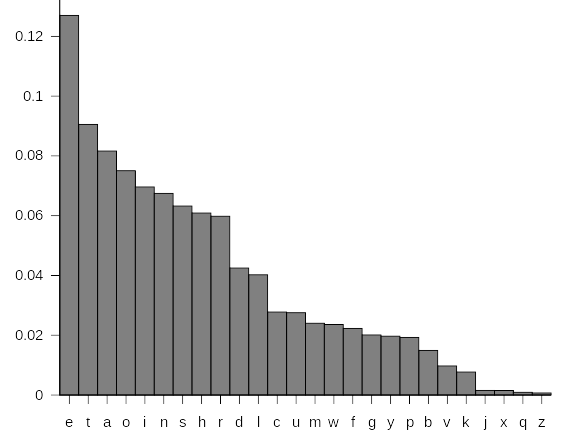
Letter frequency chart by Nandhp (public domain).
Then I thought, "Why should all the keys be the same size, when we use E waaaay more often than Z, for example?" So I looked up letter frequencies and found that in English, we use just 9 keys about 80% of the time. Since different-sized keys can't be arranged into a grid very well, I figured I might as well put the most-used keys together, and put the most common letter combinations ("bigrams," like TH and ER) next to each other.
I was pretty proud of my solution, but when I presented it to the engineering manager, he was like "WTF?" and implemented a simple QWERTY grid. Sigh. But the seed was planted.
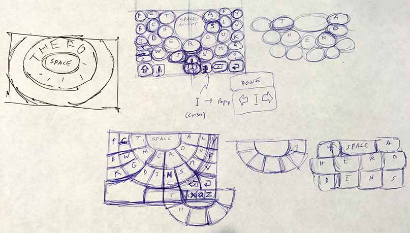
Early sketch concepts for what would eventually become HERO.
Several years and four kids later, I found myself doing a lot of one-thumb baby-holding typing and thought "there must be a better way" (to type, not parent). The old QWERTY layout might work well enough for 10-finger typing (and we've built up a lot of muscle memory for it), but it just doesn't make sense for the less-ingrained one or two-finger mobile typing.
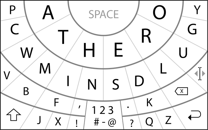
An early version of HERO, which I was calling the "Thumbprint Keyboard" at the time.
I sat on the idea for a while, as I too often do, but when Apple finally announced support for 3rd-party keyboards, I knew I had to do it — I had to try to make mobile typing better for myself and everyone else.
So while my wife baked in the sun on our kid-free vacation, I sat in the nearby shade designing HERO (which I was calling the Thumbprint keyboard at first, because early versions had more of a thumbprint pattern instead of HERO's circular rings).
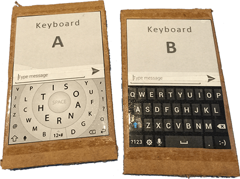
Cardboard phones for early A-B keyboard speed tests.
After cardboard usability tests and finalizing the design, it was time to find a contractor (not many had built an iOS keyboard yet), and learn all about publishing and selling on the App Store.
Results
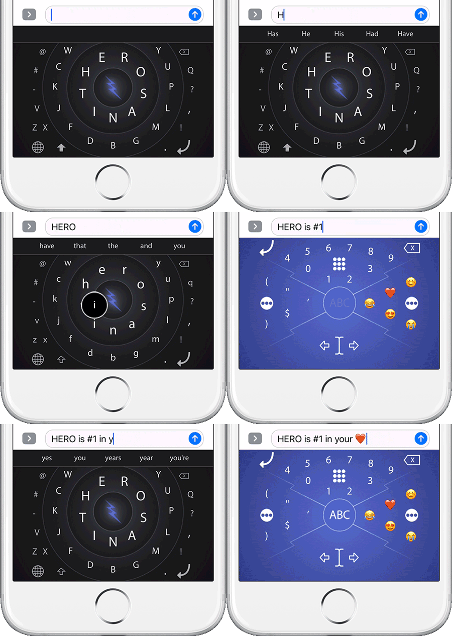
Tap HERO v2's center bolt for SPACE, or tap-hold for numbers, symbols, and emojis.
Logically, results were great:
- Finger travel is reduced by 35%
- The most-used keys are bigger than on QWERTY
- More characters (eg, @ # -) are always available
- Your recently used symbols and emojis are one tap-hold away
- It was the #7 product when it appeared on Product Hunt.
Financially, I can't call it a success. After a couple early blog posts generated two $600 sales days, sales have been sparse.
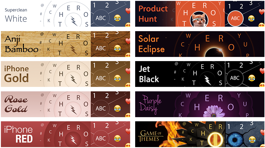
HERO's circular design allows for some interesting themes. The app is built so that new themes can be uploaded without republishing the app.
Learnin'
Launching your own product is an eye-opening experience that I recommend every designer do. It forces you to think holistically: Will people buy it? How do I build it? How should I position and market it? Should I run ads? How will I maintain and support it?
This was the first product I launched, so there was a ton of real-world learning through experience, such as:
- Creating an LLC
- Hiring and managing contract development
- Creating an Apple Developer account
- Publishing to the App Store
- App Store rejections and appeals
- Creating App Store graphics
- App Store search optimization
- Customer support
- Marketing and publicity
I suspected an alternate keyboard would be a tough sell since people are so used to QWERTY, and it didn't help that Apple's 3rd-party keyboard implementation is a bit buggy, so even well-coded keyboard apps crash too often. Also, because system keyboards are built well, people expect their keyboard to work very well, which is hard to do on a shoestring development budget. I think a better development model is to have a dev-partner whose able to provide continuous improvement.