Designing for Owl Health, the mental-health-tracking SaaS startup
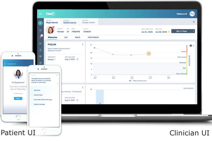
Owl's SaaS allows mental health clinicians to easily schedule and deliver "measures" (ie, short research-backed assessment tests) to patients so the clinician can monitor their patients' progress. As the sole UX Designer on a small product team, I designed new features, analytics dashboards, and high-fi interactive mockups of future concepts that helped secure $15M in Series B funding.
Problem
Therapists are busy and overbooked, so their software needs to be very efficient (to save time) and intuitive (to minimize training). Their lack of time also makes it a challenge to do any usability testing with them!
Goals
- Create a design system to speed development
- Improve the efficiency and intuitiveness of existing functionality
- Design industry-leading analytics dashboards & reporting
- Design and create advanced prototypes of future concepts for sales & investor demos
Constraints
- Limited dev resources (until Series B funding)
- Some UX debt & tech debt in the previous designs done by a contractor
- Hard to schedule therapists for usability testing
My Role
I'm the sole designer, working remotely on:
- User persona creation
- UX design and flows
- Advanced prototyping in Axure
- Creating & maintaining the design system
- UI & visual design
- Writing UI copy
The Team
I worked in an agile process with:
- VP of product
- 2 product managers
- Various subject matter experts as needed
- A small dev team
Results
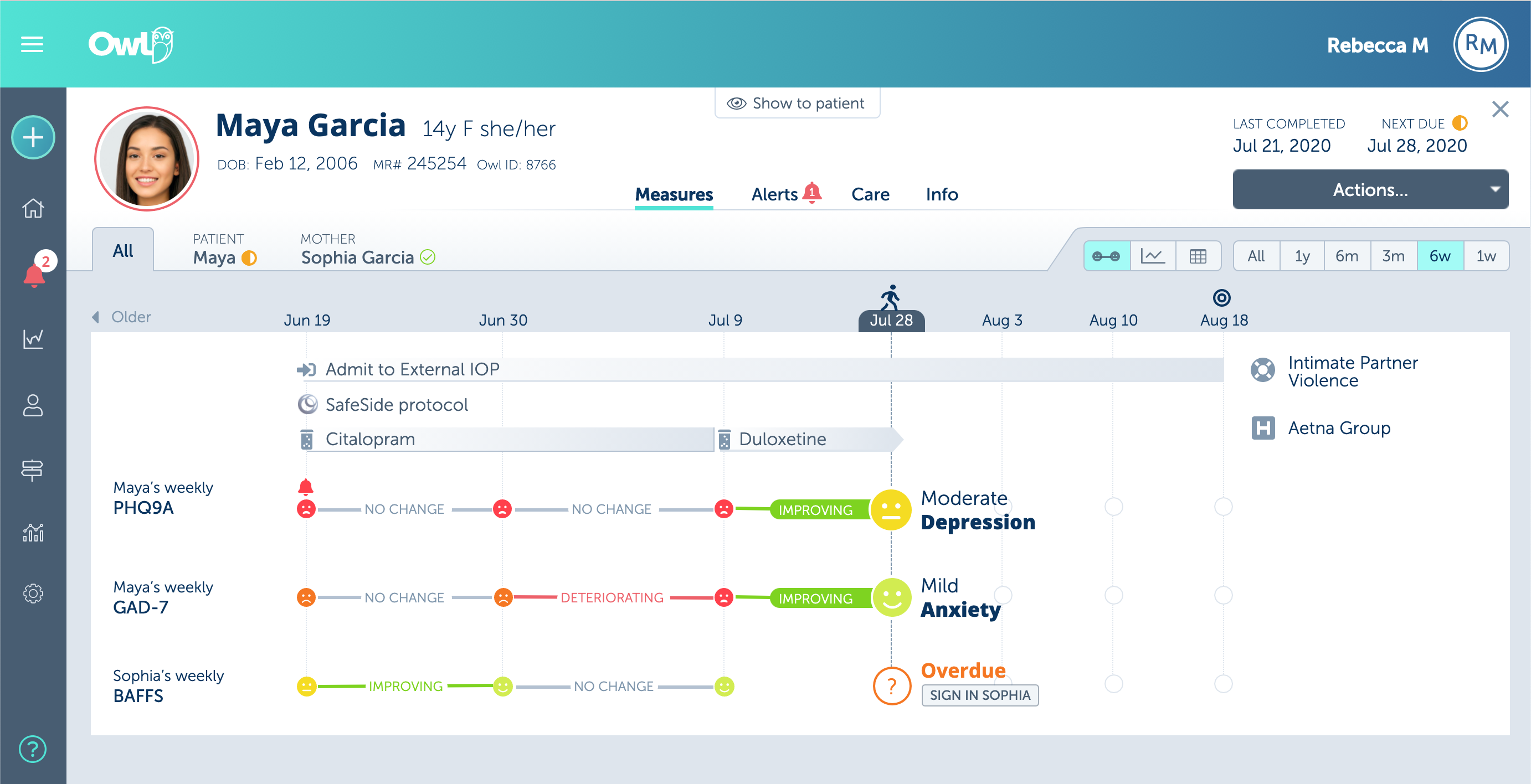
My info-packed digestible chart redesign allowed clinicians to quickly see the patient’s current status and progress over their treatment history.
One problem: Test results vary by assessment – on some, “up” is good; on others, "down" is good. Solution: I added a 'linear' view with color-coded smile/frown icons for patient severity. To draw the eye to the current status, I put it in larger stronger colors. For clinician speed and efficiency, I used tablet-friendly single-click UI elements.
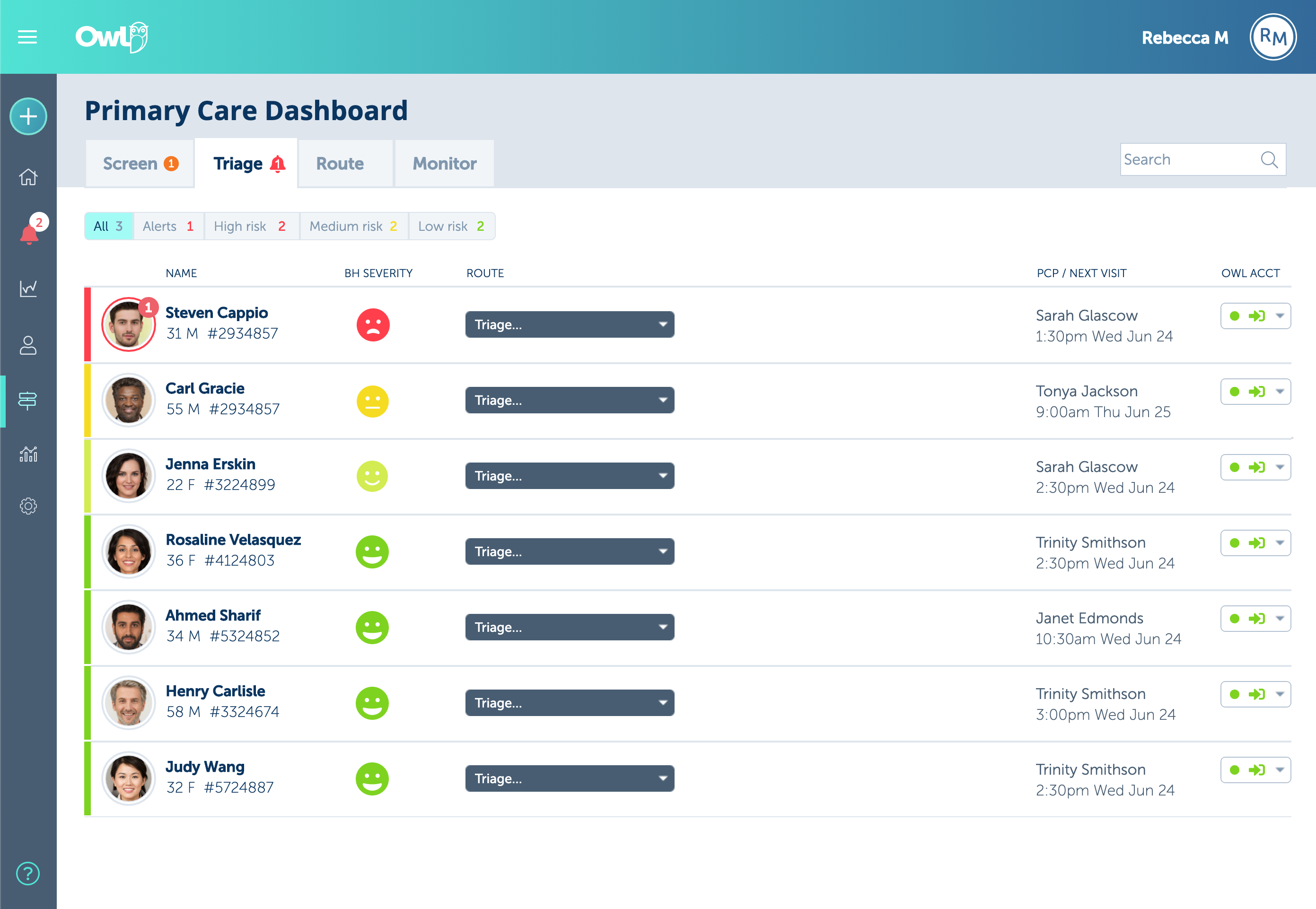
This is the Triage tab in a Primary Care Provider’s dashboard where the PCP can easily screen, triage, route, and monitor their patients for any needed mental health treatment.
The tabs' count badges are a non-interruptive way to give the user a birds-eye view of anything they may need to act on next in the other tabs.
By default, patients are sorted by severity to focus the user's attention where it's most needed, and it can be quickly filtered by other criteria for specific use cases.
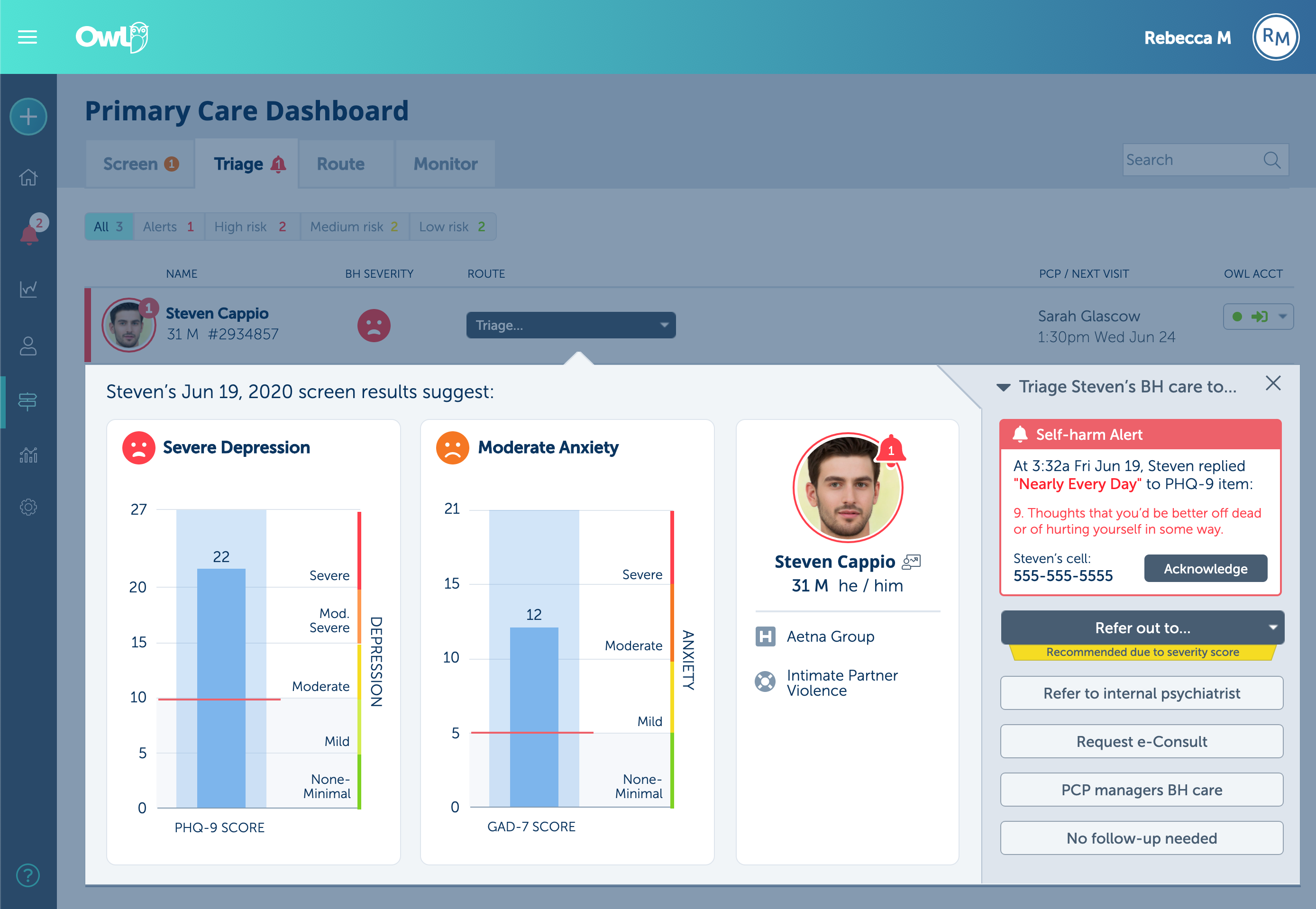
The "Triage..." button opens an efficient overlay guides that guides the clinician from the assessment results at left to the right ‘action area’ where they see treatment options, a recommendation, and any alerts that may have been triggered.
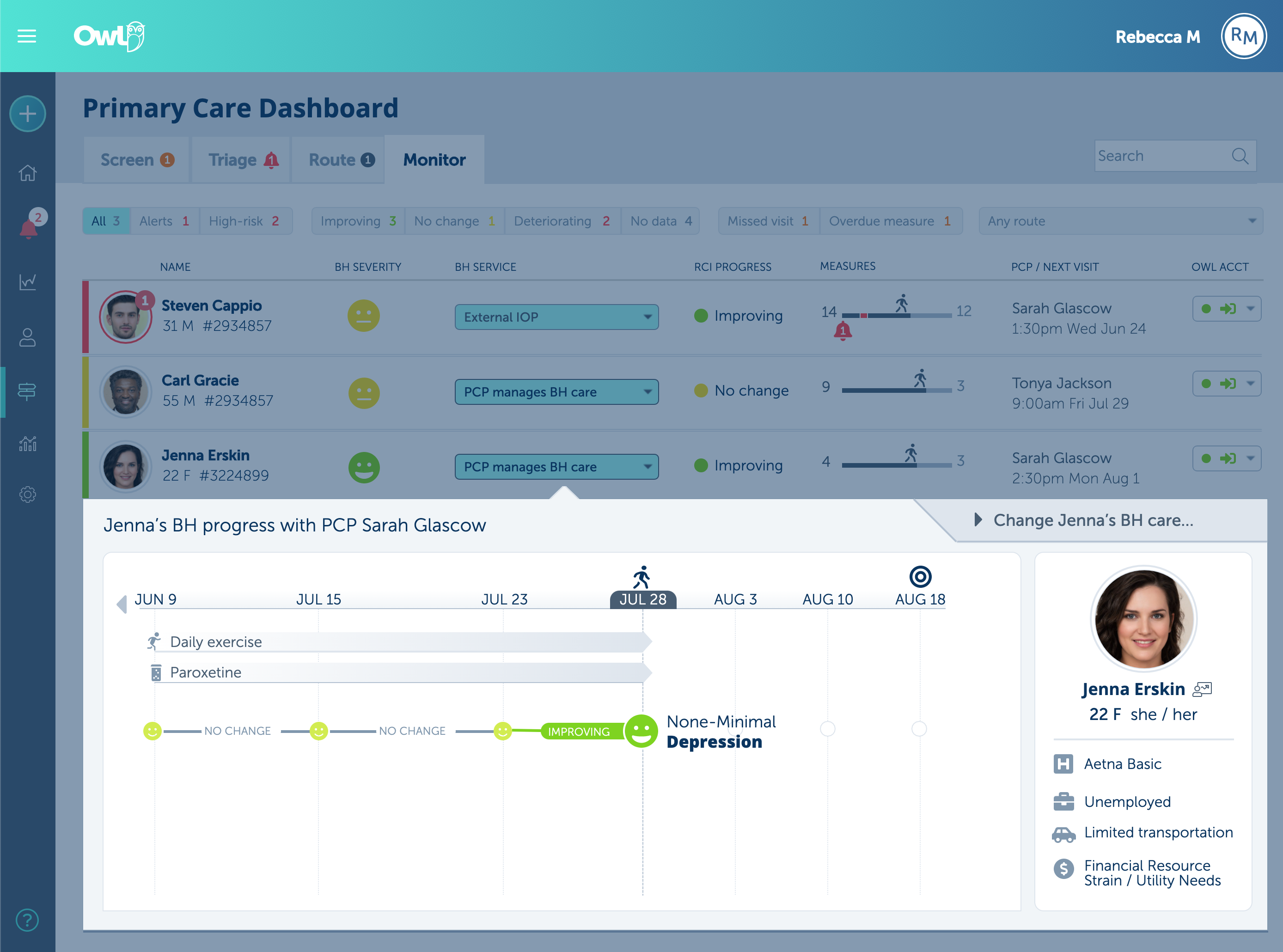
During treatment, the "Monitor" tab shows a filterable patient list.
Each patient's most relevant details are clearly shown, including a sparkline-esque treatment-journey diagram.
The 'Service' dropdown reveals a Gantt-ish timeline so the clinician can easily see how their prescribed treatments affected the patient's symptom severity.
The target success date is also shown to clarify any value-based care payor decisions.
To speed design and development, I created and maintained the Owl Design System to document the usage and styles of our components and design patterns.
Here's my advanced prototype of the front-desk Dashboard built in Axure RP that makes it quick and easy for staff to help arriving patients take their assigned assessments (aka "measures").
The design needed to be flexible and forgiving yet efficient in dealing with patients' account invitations, forgotten passwords, outdated contact info, or text vs. email preference, while still maintaining HIPAA-level privacy and security standards.
Process
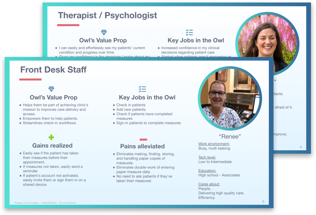
To help the product and dev teams better understand our many user types, I helped the team create user personas in Google Slides for easier multi-user collaboration.
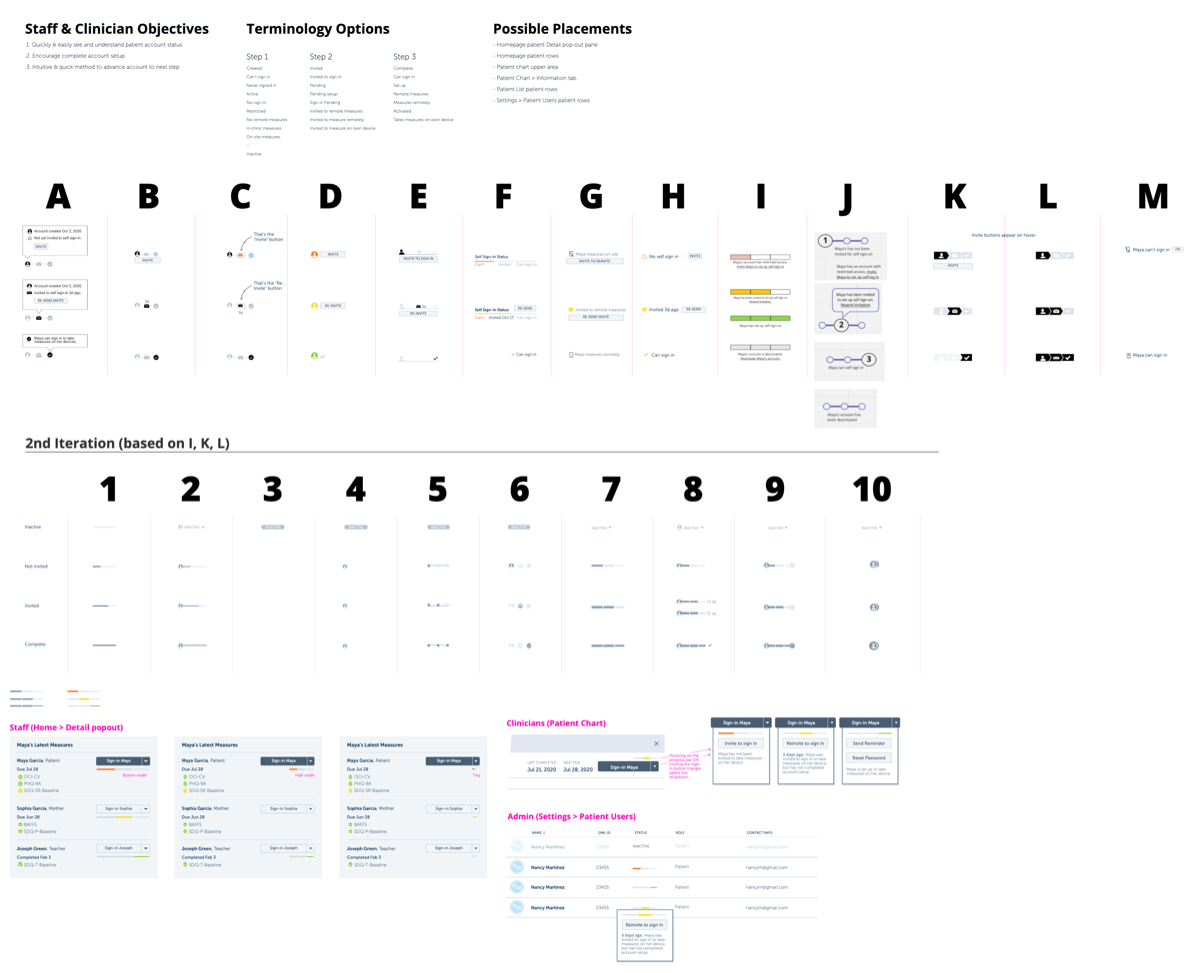
At Owl, the VP liked seeing lots of design options, so I'd generate them (eg, A-M) then we'd iterate (eg, 1-10) until reaching a final design, which I built into an advanced prototype for usability testing, stakeholder feedback, dev handoff, and sales demos. Here's a screenshot of design exploration for how staff see and manage patients' account invitation status.
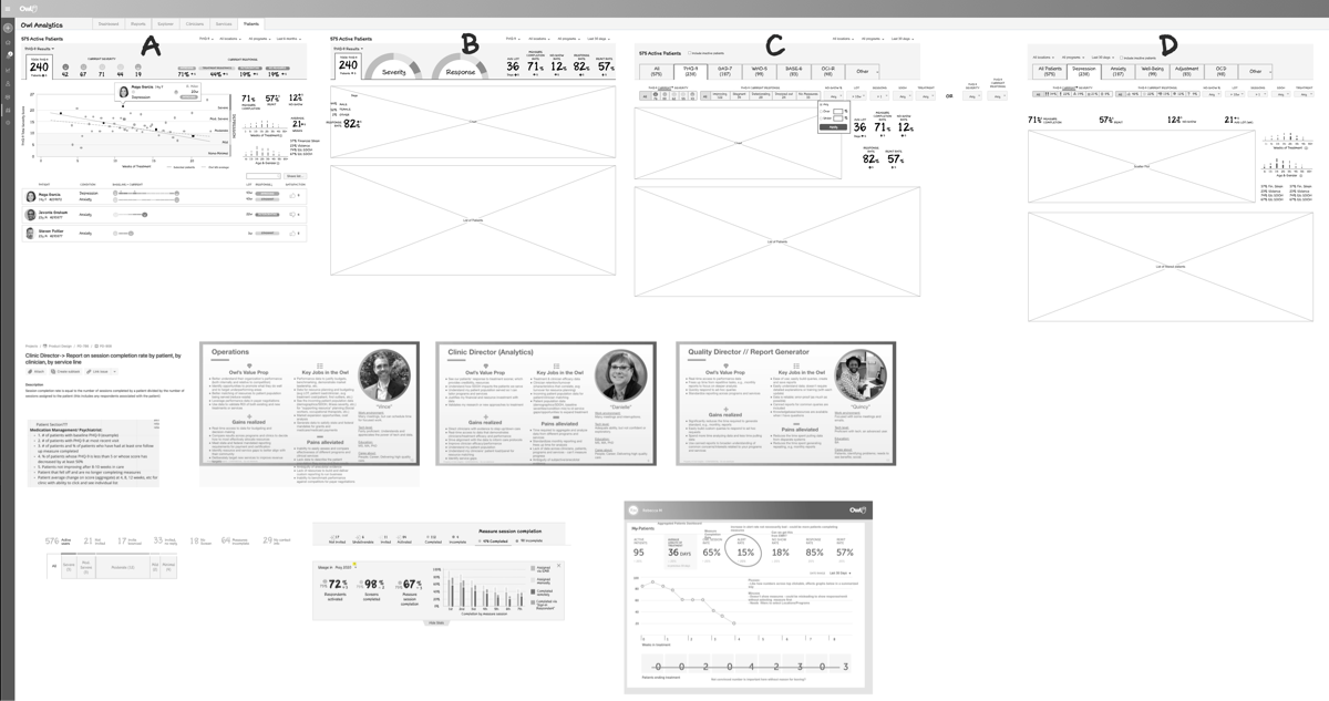
Designing our industry-leading analytics was challenging because most of our customers never had access to the level of data we could provide, so they couldn't really tell us what they wanted. We had to rely on our own hypotheses plus input from a few of our more data-savvy researchers and advisors. Here's some of the early concept exploration, with the goals and personas pasted at bottom so I could easily reference while designing.
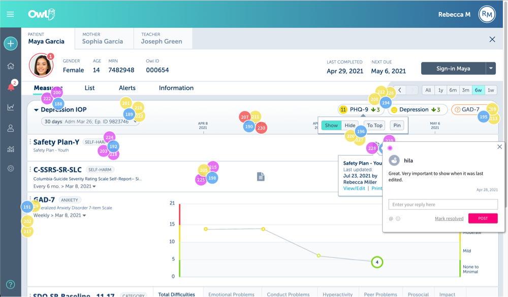
For an effort to collaboratively improve the clinician's view of the patient chart, I used a modified virtual dot voting methodology to get feedback on multiple ideas in a mockup I developed.
Learnin'
- Owl was the first startup I worked at, and now that I've worked at another and founded my own, it's interesting to see how different their culture and workflow can be from each other.
- I improved my advanced prototyping even more, building a very realistic Axure RP prototype that used dynamic date displays (ie, the dates shown in the mockup were based off the current date) and global variables to pass information between pages for a seamless demo experience.
- In my typical process, I usually self-edit much of my iteration, thus not presenting my self-rejected ideas. At Owl, I learned to preserve all my iterations so others could collaborate on the iteration.
- As the sole designer, I wore multiple hats, including designing marketing material and occasional work on the public-facing website.