User Research & Redesign of Enterprise SaaS & Dashboards
As the UX Specialist for a global multi-office civil engineering firm from 2013-2016, I researched and designed internal enterprise SaaS web apps, native mobile apps, and legacy systems that successfully increased efficiency, productivity, and profits.
Problems
- Billing delays were costing the company millions.
- Staff were wasting time and billable hours struggling to find project and contract files.
- Health & Safety incident reports were too slow with low completion rates, which increased financial and safety risk.
Goals
The goal was to do user research to find the causes of the problems, then design quick fixes and longer-term solutions.
Constraints
- We had a lot of latitude in solving problems as we saw fit, but with only 4-5 developers, we had to focus our efforts and work smart.
My Role
I worked remotely on:
- User research to find the problems
- Product Vision
- UX Design
- Writing all UX copy
- Usability testing
The Team
I worked in an agile process with:
- 1 Business Analyst
- 1 Tech Lead
- 3 Developers
- 1 Visual Designer / UI Developer
- Various subject matter experts as needed (e.g. Administrative Asst., Drilling expert, Lab Technicians, etc.,)
Process
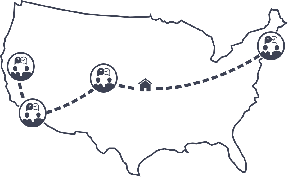
To fully understand the processes and problems, I first traveled to multiple offices to interview staffers in various roles. After assimilating the results and digging deeper as needed, I learned:
- The billing system was sending so many email notifications that most people ignored (and auto-routed) all of them.
- It was hard for staff to know which project or bill was delayed and why.
- The safety-tracking application was unintuitive, inefficient, and didn't alert people to what needed to be done, so issues got lost in the process.
I then proposed some quick fixes and started designing longer-term solutions, getting continuous online feedback from staff as I iterated and tested in clickable Axure RP prototypes.
Results
The quick fixes of sending only relevant email notifications and some minor process changes in the legacy system successfully saved money by decreasing some of the billing delays. Woot! Other solutions included:
Cost-Saving Enterprise Operations Dashboard
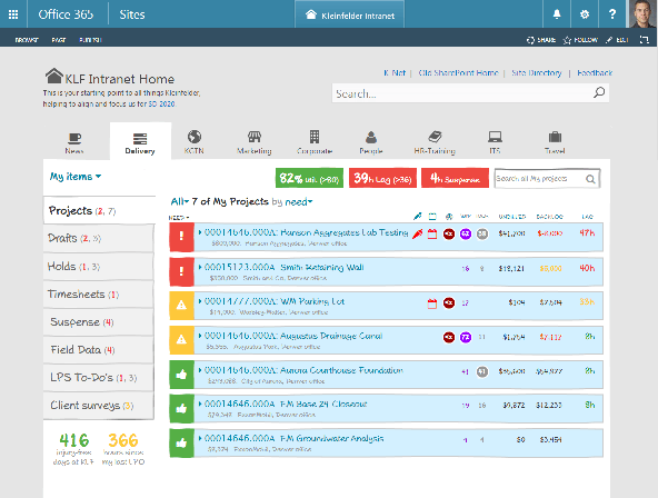
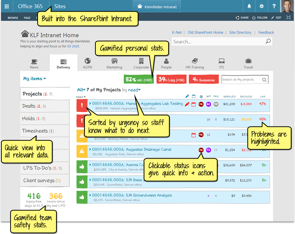
To prevent the costly delays, I designed and user-tested this dashboard concept (mocked up in medium-fidelity) so staff could see and fix issues quicker and easier by displaying:
- Delayed projects first
- Clickable actionable status icons
- Gamified stats to encourage productive behavior
Staff said the dashboard would really make their jobs easier and increase overall company efficiency.
Time-Saving Internal Project Hub
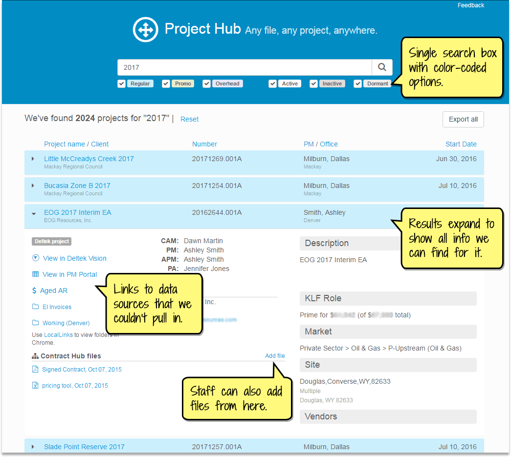
To help staff quickly find project and contract files across many servers and offices, I worked closely with our small dev team to create a silo-hiding "Project Hub" that gave staff a single search box to find any file or project.
The project-grouped results included all related project info, files, contact info, and any other data we could get live or from nightly pulls, with links to data sources that we couldn't import.
The result: Staff loved it and said it's been a huge time-saver.
Redesigning the internal "LPS" Health & Safety-Tracking SaaS
We totally rebuilt and redesigned the legacy LPS system into a modern, intuitive, efficient SaaS that made the multi-week process easier and faster for staff, and increased completion rates.
"My To-do's" listed overdue or near-due items at the top in red, while the Item Tracker tab (shown here) let you easily see and act on the status of all your items.
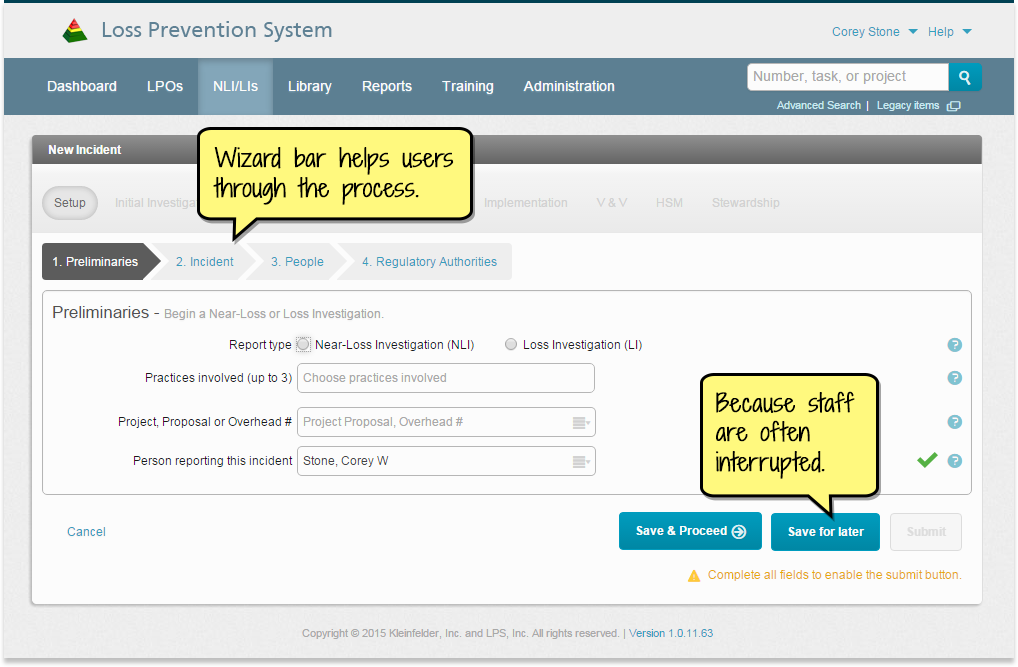
Because the multi-week process wasn't done by staff very often, the system guided them through it with wizard and process bars. Since staff get interrupted often, they could save their changes any time and return to the same spot easily.
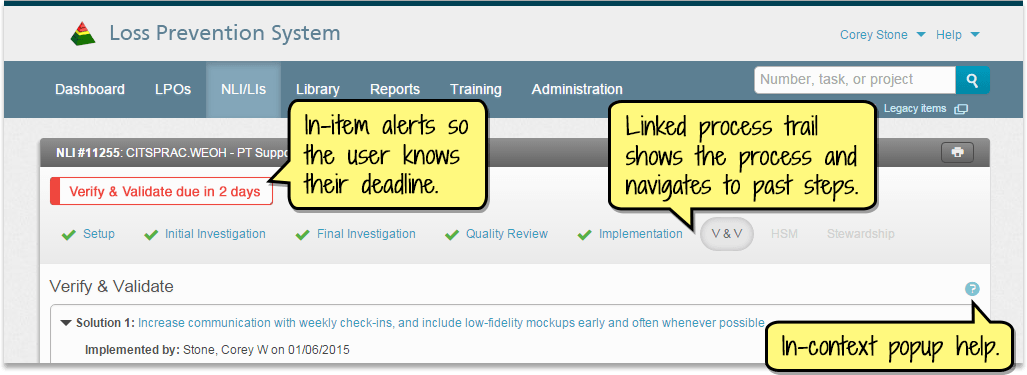
In-item deadlines helped staff know their deadlines, and contextual tooltips gave assistance when needed.
Learnin'
Through my work at Kleinfelder, I:
Improved my user research skills by doing a lot of interviewing and usability testing.
Learned the Agile process from our small team of 5.
Learned to work better with a Visual Designer, since for most of my career, I've done the UX, UI, and visual design.